
When most people think about accessibility in technology, their first thought may be about accessibility for blind or D/deaf people: captioning, visual descriptions or Braille conversion. Blind and D/deaf people aren’t the only ones who benefit from inclusive technology, though. Autistic people, people with learning disabilities, people with ADHD and other neurodivergent people also have access needs that site designers and developers can meet. Here are five ways you can make your websites and apps more accessible for neurodivergent people.
Use subtitles/captions.
Subtitles and captions for online videos aren’t just for D/deaf people or people with hearing loss. Many autistic people and other people with disabilities can have auditory processing difficulties that make it hard to understand spoken, recorded language. Using subtitles helps people follow what they’re listening to. Subtitles can also help people retain what they’ve heard long after they’ve finished watching the video.
Avoid flashing images and clashing palettes.
Quickly flashing animated GIFs or other animations are an access issue for several people. If people have difficulty processing what they’re reading, and they’re interrupted by a flashing GIF, they may be thrown off entirely. They could end up leaving your website because they can’t concentrate on what you’re trying to show them. There’s also the danger that quickly flashing animations will trigger medically threatening seizures in people with epilepsy or other seizure disorders.

The same applies to clashing palettes and site schemes. Like flashing GIFs, they make your content harder to interact with. Lime green text on a magenta background is probably not a good idea! You can also include different style sheets for your site with different levels of text/background contrast so that your visitors can choose the options that work for them.
Avoid autoplaying videos and music.
Autoplaying content can distract people from the article they’re trying to read. News sites are especially notorious for embedding autoplaying videos. This can be especially troubling if readers struggle with maintaining their attention span – they may visit your site to read an article, but they can’t absorb what they’ve read because a loud video that may or not be relevant is blasting at them. This applies both to native content from sites and apps and third-party advertising. If you embed autoplaying video ads in your site, you may end up losing potential customers because you’ve prevented them from enjoying the site you’re trying to advertise on.
Make your writing accessible.
The heart and soul of online content is writing. Your words matter, and the way they come across to readers matter. When writing online content, it’s important to be mindful that people with different reading skills may be reading your content. People with intellectual disabilities, cognitive disabilities or dyslexia may struggle with long-winded paragraphs or jargon-packed sentences. If you want to get a rough idea of how readable your article is, you can use an online readability checker, like the one at readable.io. These checkers examine written content for sentence length, syllable counts and other attributes that can affect how easy it is to read something.
The same applies to the text in online or mobile apps. Keep it simple. Understanding is the goal. You’ll find that making instructions and user interfaces understandable will help everyone who uses your products.
Use readable typography.
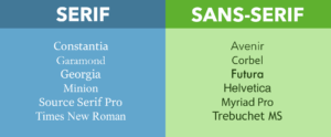
The font you use on your websites and apps matters. Some fonts are more readable than others. Sans-serif fonts are easier to read for many people than serif fonts are. This is because it’s easier to tell letters apart with sans-serif fonts. Serif fonts have little ‘feet’ on the letters. Examples of serif fonts are Times New Roman, Georgia, Palatino and Garamond. Examples of sans-serif fonts include Helvetica, Arial, Avenir and Verdana. Make sure to set the text you use at a readable size (at least 11 or 12 points, 1 em or roughly 14 pixels), too.
It’s also helpful to use sans-serif fonts that distinguish between capital I and lowercase l so that people can tell them apart easily. Some common fonts available on most computers that do this are Verdana, Trebuchet MS and Tahoma. You can also download the Source Sans Pro font or use it as a web font in your site or app.
Be careful about using gaudy display fonts or swirly script typefaces in your headings and logos. These are more difficult to read than more standard-looking fonts. You don’t have to be boring and consign yourself to Times New Roman and Verdana; there are readable fonts that are visually interesting. You just want to make sure that people to be able to read your attention-grabbing headlines.
And for heaven’s sake, the landline telephone number should not be your only point of contact!
1)What are Deaf/deaf people going to do?
2)Phone Anxiety. Super common amongst Autistic/autistic people.
This page has a clashing pallette and a sheer effect when I scroll. Reader view works for the main article, though, which is better than many sites.
Saved as a favorite, I really like your blog!
Thank you for this. I serve on a Statewide Independent Living Council and we are always working to make our products accessible to our cross-disability, multi-age consumers. This helps.